UI/UX Design
UI/UX Design Services: Research, Interfaces and Design Systems
We provide ui ux design services that map the journey, structure the screens, prototype the flow in Figma or Adobe XD, and hand engineering a file it can build from. Contrast, focus order and target sizes are decided in the design file rather than retrofitted after an audit, and every screen is tied to a task somebody is trying to finish.
What this service covers
- Figma & Adobe XD as the working files
- User journey mapping and information architecture
- Wireframing & prototyping before anything is built
- Accessible interface design and component libraries
- Handoff documentation engineering can work from
UX and UI are two different jobs
The two letters get sold as one service, and they are not the same work. UX is structural: who the user is, what they arrived to do, the order the steps happen in, what the system calls things, what appears when something goes wrong, and what the person sees before any data exists. Most of that is settled in journey maps, screen inventories and grey-box wireframes with no colour in them at all.
UI is the surface that carries those decisions: type scale, colour, spacing, icon set, the default, hover, focus, active, disabled and loading states of every control, and the component set that keeps them consistent from screen to screen.
A product can have attractive UI over broken UX — a handsome form that asks for a delivery address before it knows what is being delivered. Ordinary UI over sound UX is the far more recoverable problem.
We keep the two separate on purpose, because debating button colour while the flow is still wrong is the most reliable way to spend a design budget on nothing. Our ui ux design agency approach also decides who needs to be in which review: the flow is a business decision and needs whoever owns the process, while the surface is a brand decision and needs whoever owns the brand. Putting both groups in the same meeting is how a wireframe review turns into a colour argument.
UX decisions
Entry points, step order, navigation model, naming and labels, required versus optional fields, error and empty states, what happens on the second visit.
UI decisions
Type and spacing scales, colour roles, contrast, iconography, component anatomy, every interactive state, and how the layout behaves at each breakpoint.
Deliverables
What design work actually produces
Not a mood board. A design engagement produces artefacts that other people can act on — a builder, a marketer, a support team, and the developer who has to turn it into working software.
User journey map
The route a person takes from the trigger that sent them looking, through the screens, to the point the task is finished — with the moments they drop out marked.
Information architecture
A screen inventory and navigation model: what exists, what it is called, what sits under what, and which routes reach it.
Wireframes
Layout and content priority in grey, resolved before anyone argues about colour. Fast to draw, faster to throw away.
Clickable prototype
The real flow, linked screen to screen in Figma or Adobe XD, so stakeholders and testers can attempt a task rather than imagine one.
UI screens and states
Final visuals including the unglamorous versions: empty, loading, error, no-permission, one item and two hundred items.
Design system or component set
Tokens for colour, spacing, type, radius and elevation, plus documented components — for projects large enough to need one.
Engineering handoff
Named frames, a spacing scale, specified breakpoint behaviour, and every interactive state a developer must implement.
Usability test notes
What people were asked to do, where they hesitated, what they got wrong, and which of those we changed in the design.
Why wireframes and prototypes cost less than changing built software
Redrawing a wireframe takes an afternoon. Rewiring a prototype takes a day. The same change made after the screen is built is never one change on its own — it arrives with a queue of consequences behind it, and the queue gets longer the later the change lands.
The design file is the cheapest place in the whole project to be wrong, which is exactly what it is for.
A written specification produces polite agreement. A clickable prototype produces the useful sentence — "wait, how do I get back to the list from here" — while it still costs nothing to fix. Prototypes also settle arguments that documents cannot: how many taps a task really takes, whether the second step makes sense without the first, and whether a person can find the thing they came for without being told where it is. This is a core part of our ui ux design services.
Usability testing without a lab
You do not need a research facility or a large panel. We book representative users one at a time, give each of them a single flow to attempt on the prototype, and watch.
The technique matters more than the sample. We set a task, not a question — "find last month's invoice and download it", never "do you like this page" — then stay quiet and record where the person hesitates, backtracks or picks the wrong control. An opinion about a design tells you what somebody expects to feel. A recording of somebody failing a task tells you what the design does.
What one change costs at each stage
The change itself is the same size at every stage. What differs is how much has already been built on top of it.
| Where the decision is changed | What has to change with it |
|---|---|
| Journey map or screen inventory | A diagram and the conversation about it. Nothing downstream exists yet. |
| Grey wireframe | The layout of one screen, and the two screens either side of it if the step order moved. |
| Clickable prototype | The links between frames, plus any screen whose purpose has shifted. Still no code. |
| Final UI and component set | The component, every state drawn for it, and each screen that uses it. |
| Built, not yet released | Markup, styles, component state, validation copy, the shape of the API response, the tests covering it, and a QA pass. |
| Released to users | All of the above, plus a data migration where the model changed, updated help content, and a note to people who learned the old way. |
A worked example: a quote form nobody finishes
This is not a case study; it is the shape of a problem that turns up often. A service business has one long quote-request form — a dozen fields on a single page — and a lot of the people who start it never send it. The instinct is to redesign the form: tidier fields, a friendlier button, a progress bar.
The wireframe stage asks a different question first. Which of those fields does the business genuinely need before it can reply, and which exist because a CRM has a column for them? Usually three or four are load-bearing and the rest can be asked in the reply, or on a second visit once there is a reason to trust you. That is a UX decision, and it is the one with something at stake.
What follows is structural rather than cosmetic: the load-bearing fields go first, so somebody who abandons halfway has still sent enough to be contacted; the page says what happens next and roughly when; and the field that tends to stall people — often a budget box with nothing in it — is marked optional and offered as a range. Only then does the UI stage decide what any of it looks like.
The prototype goes in front of a handful of people with one instruction: ask this company to quote for the thing you actually want. If they finish, it gets built and the completion rate is watched after launch. If two people in a row stall on the same field, the field is the problem, and no amount of styling will fix it.
Decided in the file
The accessibility work that belongs to design
Accessibility splits across two stages. Headings, landmarks and form markup are settled when the templates are written. Contrast, focus order, target size and labelling are settled when the screens are drawn — reopening those after an audit means reopening the palette and the layout with them, so we hold WCAG 2.2 AA as a design constraint rather than a later checklist.
Contrast, chosen in the palette
WCAG asks for 4.5:1 on body text and 3:1 on large text, icons and interface components. Pale grey on white and white on a light brand colour fail it, so the palette is checked against those ratios before it is approved, not after the brand has been signed off.
Focus order and a visible focus ring
Keyboard users move through a page in DOM order. The design has to make the visual order match it, and must include a focus style that is genuinely visible — removing the outline without replacing it is a design decision, and a bad one.
Target size and spacing
WCAG 2.2 sets a lower bound of 24 by 24 CSS pixels for interactive targets, and both platform guidelines are more generous. Thumb-sized controls with real space between them prevent the wrong tap on a phone-sized layout, where controls sit closest together.
Visible labels, not placeholder text
A placeholder disappears the moment somebody types and is invisible to some assistive technology. Every field gets a persistent label, an error message written in words, and a state that does not rely on colour alone to communicate.
Designing the narrow viewport first
Designing at 1440 pixels wide and squeezing the result down produces navigation nobody can reach with a thumb and tables that turn into horizontal scrolling. We start at roughly 360 to 390 pixels wide, where the constraints are real: one column, one primary action per screen, full-width fields, the right on-screen keyboard for each input type, and long tables redrawn as stacked cards rather than shrunk.
The narrow column is the only width that forces a decision about what matters most. Widening a layout afterwards is space to add; narrowing one is space to reclaim, and something always loses.
Breakpoint behaviour is then written into the file rather than left to interpretation, so a developer is never guessing what a three-column grid should do at the awkward sizes in between. The same goes for the two layouts people forget: a phone held sideways, and a browser at default zoom on a small laptop.
When a project is big enough for a design system
A design system is a cost as well as an asset — somebody has to maintain it. A five-page brochure site does not need one; a consistent set of styles is enough, and a system below that threshold costs more to keep than it ever saves.
The rough threshold: more than one person building the interface, a screen count past a couple of dozen, or a roadmap that continues well beyond launch and will rebuild the same patterns repeatedly.
Past that point a system pays for itself: tokens for colour, spacing, type scale, radius and elevation, then documented components with each of their states and a short note on when to use which. The value is not tidiness — it is that a new screen becomes an assembly job instead of a design job, and the interface stops drifting apart module by module.
What a developer needs from a design file
A beautiful file that cannot be built is an expensive picture. Our handoff is judged by whether an engineer who was not in the design meetings can implement a screen without asking a question:
- Named frames and layers — not "Group 47 copy 3"
- A spacing scale, so gaps are 8 or 16, never 13 because it looked right
- Colour and type as named tokens that map to CSS variables
- Every state drawn: default, hover, focus, active, disabled, loading
- Empty, error and long-content versions of each screen
- Stated breakpoint behaviour and what reflows at each one
- Exportable assets and the alt text the designer intended
Telling design work from decoration
The honest test is whether anyone can name the number the work is meant to move before it starts. Forms abandoned partway through. Checkouts started against checkouts completed. Screens or taps needed to finish one task. Support tickets that name a particular screen. Sign-ups that reach the second step. Applications finished in one sitting rather than left open and never resumed.
With a measure agreed, disagreements become answerable: run the task with a few users, compare completion, keep the version that wins. Without one, review meetings collapse into taste, the most senior person in the room decides, and nobody can tell afterwards whether the redesign helped or simply looked newer.
So the first question we ask is not what the site should look like. It is what a visitor is trying to finish, and how you will know whether more of them managed it.
Where design engagements go wrong
Design work rarely fails at the drawing. It fails on how the engagement was set up, and each of these four is avoidable if it is named before the work starts:
- Approval by committee with no named decider. Five people leave conflicting notes, each round averages them, and the result offends nobody and helps nobody.
- Real content arrives after the design. Screens drawn around neat placeholder text break when the actual product names run to three lines and half the descriptions are empty.
- No access to anyone who uses the thing. Testing then becomes internal opinion, and the people inside a business know the system far too well to be surprised by it.
- Design brought in last. Once the schema and the API are fixed, design can only decorate decisions that were already made elsewhere.
How design is scoped and priced
Our ui ux design services can be part of a build or a standalone piece of work. A standard website build starts at $399 and includes interface design for the pages in scope. Maintenance from $49 per month covers the small design and content changes that accumulate after launch. Research, journey mapping, a clickable prototype, usability sessions or a design system are quoted per project, once the number of flows and screens is known.
Where scope has to come down, we would rather cut the number of flows than thin the research out of the ones that remain. A half-researched flow is a guess with a nicer surface on it.
Where a project starts with discovery rather than a finished brief, the journey map and the prototype are usually the first two deliverables, and everything after them is estimated against what those two settle. Where the brief is already firm and the flows are conventional, wireframes can be skipped and the work starts at UI. We will say which of the two your project is before quoting it.
What we need from you
Design stalls on inputs more often than on effort. Four things are worth arranging before the first session rather than during it:
- One named decision-maker who can approve or reject a screen without convening a meeting.
- Brand assets if they exist — logo files, fonts and colour values — or a decision that settling them is part of this work.
- Real content, or a fair sample of it, before the UI stage: actual product names, actual field labels, the longest description you have.
- An hour each with a few people who use the current system, or would use the new one. Colleagues who built it do not count.
Anything we cannot see from the outside is worth saying early too: a platform you have to stay on, a regulator's requirement, a report somebody must be able to print.
Our ui ux design agency team pairs directly with our web development and mobile app development work, so the file you approve is the file the same team builds — the handoff is internal, and the questions a developer would otherwise email back get answered while the screens are still being drawn.
All prices in US dollars (USD). We can invoice in GBP, EUR, AUD or INR on request.
UI/UX design — FAQs
Ping us for your IT solutions
Tell us what your users are trying to finish
Send the flow that is losing people, or the screens you already have. We will tell you whether it needs research, a prototype, a visual pass or nothing at all — and what each would take.
Mon–Fri, 09:00–19:00 IST (UTC+5:30) — 4+ hours of live overlap with US Eastern; full overlap with UK and EU mornings.
Proof of work
UI/UX Design projects we have delivered
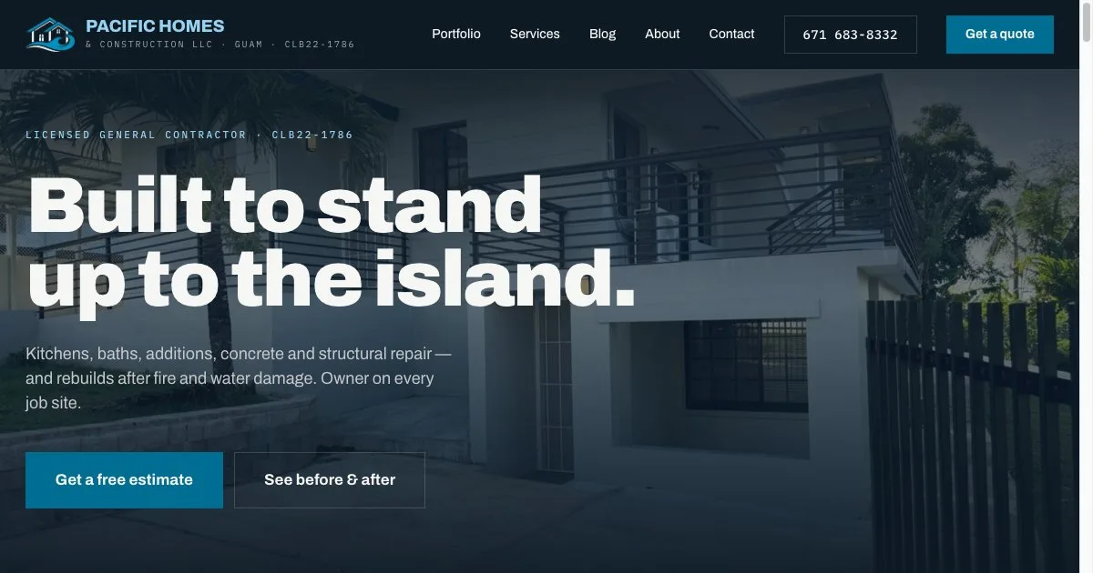
Contractor website with a before-and-after project gallery
Pacific Homes & Construction · Guam
A website for a licensed Guam general contractor, built around a fifteen-project before-and-after gallery, a page for each trade and phone, WhatsApp and email enquiry paths.
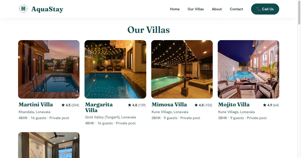
Villa rental brand site with direct enquiries and aggregated reviews
AquaStay · Lonavala, India
A brand website for a five-villa rental business in Lonavala and Khandala: a page per villa with capacity and amenities, 529 guest reviews brought together from Airbnb and MakeMyTrip, and WhatsApp and phone enquiries.

Job portal for a recruitment business
A recruitment business
A job portal for a recruitment business, covering job listings, applications and the administration behind them.
Get a quote
Tell us about your UI/UX Design project
A scoped estimate within one business day. No obligation.
Request a free quote
Hourly engagements from $25/hour · websites from $399 · maintenance from $49/month. Quoted in USD; GBP, EUR, AUD and INR on request.
Related services
Corporate Training
Hands-on, expert-led technical training for teams across modern web, mobile and cloud.